With its intimate knowledge of the plant, Tower Three invites cannabis connoisseurs to experience a reimagined level of quality.
Tower Three Cannabis Marketing Portfolio
Family-owned and operated in Taunton, Tower Three is a cannabis brand with a business mission to provide 100% organic cannabis grown in living soil to the Massachusetts community.
Cultivating for over six years, the company was founded on friendship and determination for quality cannabis on the market. Today, the company is 43% minority and women-owned and has proudly perfected its Signature Process of cannabis cultivation.
With a high-level, quality cannabis operation in place, Tower Three came to our Cannabis Creative Marketing Agency in need of a strong brand messaging, logo creation, and packaging design that would complement these core company values.
Their tight deadline and spirited ideas made it an ambitious job for our cannabis marketing agency – but our branding team was up for the challenge!
Tower Three’s passion for cannabis knowledge motivates them to provide the best consumer experience with their products.
With a confident company value and mission for organically grown cannabis, the challenge for Cannabis Creative stood to bring their passion and integrity into a strong brand message.
Tower Three didn’t want to be just another pre-roll and flower brand in Massachusetts. They wanted to be perceived as a luxurious, passionate, scholarly, and timeless flower brand that has full transparency in their cultivation process.
They were proud to be one of the very few cannabis brands on the market that cultivate with organic, living soil growing methods – so our cannabis branding team crafted a brand identity and message around their exceptional process.
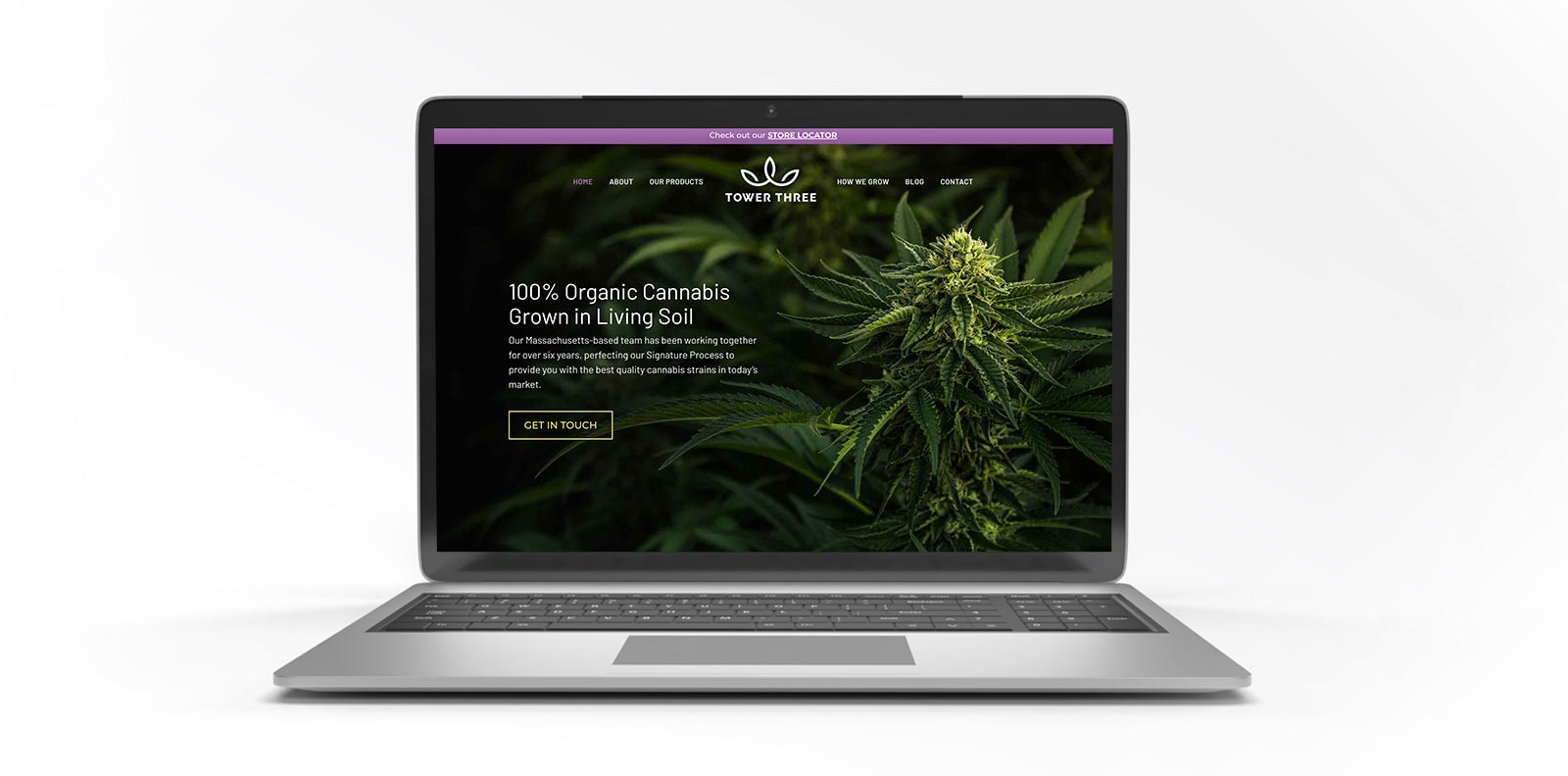
By focusing on their living soil approach, Tower Three’s brand messaging was informative yet exclusive to their unique cultivation process. Their brand voice rings charming, sophisticated, and caring while helping educate their targeted audience.
Tower Three’s brand voice encourages consumers to understand how cannabis growing in living soil has a better taste, long-lasting high, and overall higher quality experience.
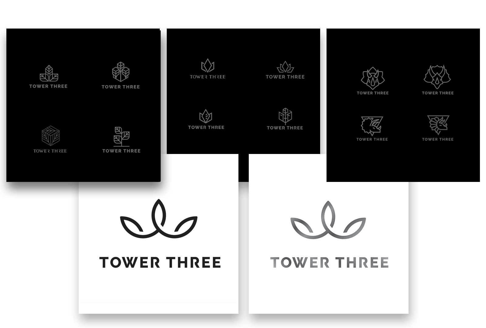
Once a clear and concise brand message was established, our marketing agency created a logo to match.
In the initial stages of the logo designing process, our design team brainstormed with Tower Three on thoughts and ideas for a design. While open to exploring many looks and colors, Tower Three was sure of wanting a logo that was different from the crowd of brands seen on dispensary shelves already.
To match its sleek and sophisticated brand message, Tower Three’s logo was designed to bring simplicity yet captivate the consumer into a deeper connection with the brand.
Our design team chose a font style that boldly presented the brand name without being overly flashy or loud. The points in the logo symbolize the “three” in the brand name and the plant being offered.
When it came to choosing a color scheme for Tower Three’s logo design, the team wanted to choose a color different than what was out there already, one that wouldn’t fade out of sight for shoppers. Dark hues of black and grey take over the base of the logo, while a shade of purple brightens the logo and brand name.
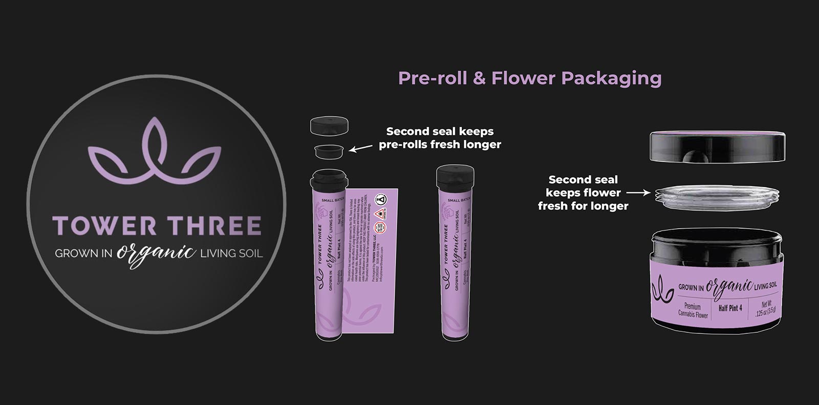
With bold packaging design, Tower Three wanted to push past the norm and create a new horizon of quality cannabis.
The unique shade of purple in Tower Three’s logo creation poured into their packaging – where our cannabis packaging and design team crafted a look for their pre-roll and eighth-jar cannabis products.
Both packaging design layouts included the styled logo, font, and color scheme created for Tower Three, as well as simple messaging that briefs the quality contained in each product.