Brand design is what everyone thinks of when you talk about brands: logos, fonts, colors, etc. It is the process of crafting the visual identity that represents the overall brand.
If your brand is a person with a distinct personality and core values, then the brand design is the way that person dresses, similar to how clothing choices and the outward “vibe” of someone you meet on the streets may communicate the type of person they are and leave an impression on you.
Of course, marketing cannabis is never as easy as it seems. In addition to the general marketing and design principles that apply to brand design, cannabis businesses also need to understand the rules and regulations put forth by their state.
For instance, some states do not allow cannabis imagery in brand design, which technically conflicts with design recommendations. Cannabis branding should, therefore, reflect your brand strategy while remaining compliant.
Here is everything you need to know about designing a cannabis brand:
What is brand design?
The visual identity of your brand consists of logos, fonts, color palettes, and photography. These elements are used consistently across all touchpoints of the brand, such as websites, advertising, packaging, and products, to create a strong and recognizable visual representation for your customers.
The goal of brand design is to communicate your brand’s values, personality, and messaging to consumers and distinguish it from those of your competitors through that visual identity.
Therefore, it’s important that your brand design process is not informed by your personal preference or purely by the “vibe” and “aesthetic” of your brand, but rather by the foundation of your brand.
Let’s dive deeper into each visual element of a brand:
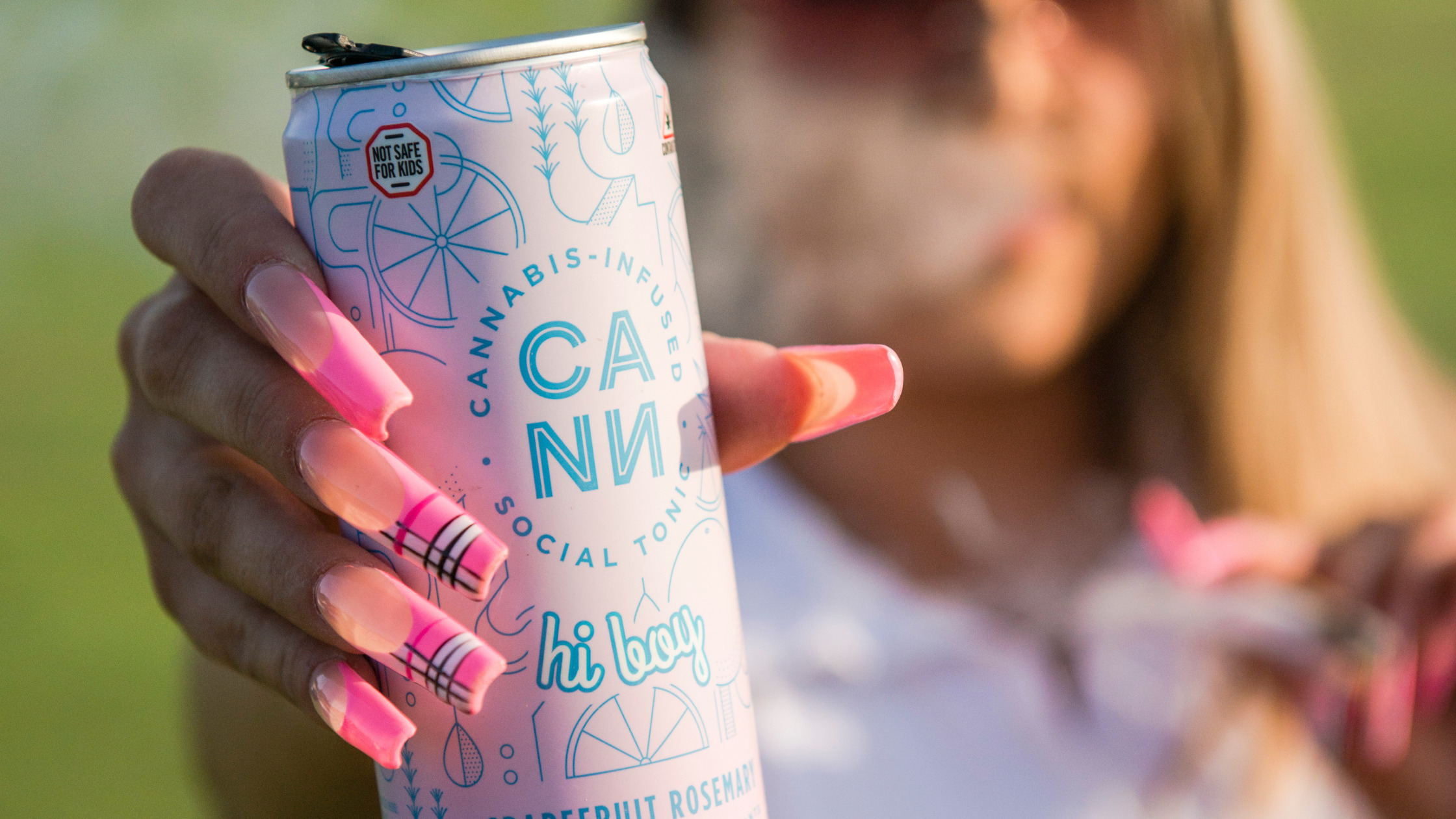
Cannabis Logos
A logo is a design that represents your business at the top level. It functions as the centerpiece of your visual identity as it will appear across both online and offline touchpoints, such as your website, product packaging, and more,
A good logo should convey the values, personality, and messaging of the brand it represents. In other words, it needs to communicate the overall feeling that you aim to evoke as a brand.
There are five principles of a good cannabis logo design:
1. Simple
Your logo should be distinct without being overdrawn. Consider the different use cases – storefront, packaging, merchandise, etc. Avoid a busy logo and stick to something that feels representative of your core values and overall personality.
2. Memorable
Logos are meant to evoke feelings through design, stylistic treatment, colors, etc. When you see the Yves Saint Laurent logo, you get a feeling of sleek, timeless luxury. In the same way, your logo should be memorable by evoking a feeling that aligns with your brand foundation.
3. Timeless
A practical logo should endure changes in the industry. As cannabis becomes more advanced, we may see brands move away from on-the-nose imagery around the plant. Ask yourself, will the logo still be adequate in 10, 20, or 50 years without having to make drastic changes?
4. Versatile
As the centerpiece of your visual identity, you want your logo to stand out across a variety of applications. For instance, it should work at the size of a business card as well as a billboard. Ensure that the design of your logo can be utilized with flexibility.
5. Compliant
There are varying rules and regulations around your logo design based on your state. It should not be appealing to children and, in some states, you cannot feature a cannabis leaf! For the most part, you’ll want to avoid cartoon-style visuals or animals. It is also a good idea to avoid cannabis leaves or even the word “cannabis” itself.
Look into your state policies and guide your creative direction accordingly.

Typography
A type suite is a system of typographical choices for a brand, including specific typefaces, font weights, sizes, and styles that are used consistently across different marketing channels, such as headers, body copy, and so on.
The type suite is a key part of a brand’s visual identity, as it helps to convey the brand’s personality and tone. For instance, you could use bold and editorial-like fonts for a brand that wants to be an advocate and make some noise or you could use smooth, flowing, modern fonts for a more peaceful, luxurious feel.
A well-designed type suite can make a brand appear modern, classic, sophisticated, playful, and so on, depending on the typographical choices made. There are three principles of a good cannabis font selection:
Legibility
Choose a font that is easy to read. The space between different letters and numbers should be enough to skim. There are tons of fonts out there that can add some interesting personality to your brand without forcing your customers to squint to make out the content of your message. It also makes your brand accessible to those using screen readers or dealing with visual impairments.
Tone
The font you choose should reflect the tone and personality of your brand. Each font and font style brings different characteristics to the table, so choose wisely. For instance, serif fonts are considered to be stable, responsible, and dependable.
You will find some serifs are blocky while others are rounded and subtle. On the other hand, sans-serif fonts are considered to be modern, relatable, and easygoing. With this in mind, a formal or traditional brand might choose a serif font, while a younger, more playful brand might choose a sans-serif font.
In combination, all these elements give off different messages: elegance and sophistication versus brightness and altruism. These differences in typeface personalities will not only affect your designs but also the tone of your messaging and ultimately, the way your customers interpret the subtleties.
Functionality
Font is one of the more practical aspects of your visual branding. Consider the functionality of your selected font in different contexts. Will it work well on a website, on your packaging, and on social media?
Cannabis Brand Color Palettes
Color is a deeply psychological choice when it comes to your visual brand. The long and the short of it is that color, like the other visual elements, is chosen to reflect tone, personality, and emotions.
It is part of why so many brands in the cannabis industry lean into the whole “green” color scheme. However, it’s not just cannabis. Take a stroll down your local Target and you’ll see that so many product segments look almost identical.
Sunscreen bottles are often blue and yellow or yellow and white. Lip products are always some shade of pink or red. Even if you open your phone, you’ll see a lot of search engines and social media apps are blue (Facebook, Safari, Internet Explorer, Twitter, etc.).
Regardless of the industry, it seems that everyone is trying to do the same thing – and there are two sides to the story that are worth acknowledging.
First, it’s not always a bad thing to go for the “expected” colors. It’s often the obvious choice, making it easy for consumers to understand the message. If you use green as a dispensary, they can easily understand that you’re likely selling cannabis products and an overall more plant-touching business than, say, a B2B service like a cannabis marketing firm.
Second, is that deviating from those colors will absolutely make an impression. For instance, if you’re a cannabis brand using red and gold instead of green when all your competitors are using green, it will draw the eyes of your customers.
With that being said, there is never a correct way when it comes to selecting your colors. Think of it simply as a dial (one of many) that you can adjust to infuse personality into your brand.
Still, there are three general principles you can keep in mind for a good cannabis brand color palette selection:
Tone + Personality
Choose colors that reflect the tone and personality of your brand. For example, bright, bold colors might be appropriate for a youthful, energetic brand, while more muted or neutral colors might be better for a more traditional or upscale brand.
Whatever emotion it is that you want to evoke in your customers, think of the colors and shades that align with that emotion.
Audience Alignment
It’s important to decenter yourself during this process. Consider the preferences and associations of your target audience when choosing colors. Different colors can evoke different emotions and meanings, so it’s important to choose colors that resonate with your audience.
Compatibility
Consider the compatibility of the colors with your overall design aesthetic and the other elements of your branding, such as fonts and graphics. You should also be sure to observe the way each of the colors in your palette works together.
Cannabis Photography
Typically, people think the visual brand ends with logos, fonts, and color palettes. However, photography can play a significant role in brand strategy by helping to visually communicate the values, personality, and message of a brand more realistically – especially for cannabis brands.
Imagery can be used in a variety of marketing materials, such as website design, social media posts, and print advertisements, particularly to communicate the lifestyle elements of a brand: the type of people you are targeting, the look and feel of your products in a day-to-day setting, and so on.
This is powerful for cannabis brands that often have to be careful about how they showcase products or whether the plant or product is shown at all. Some compliance teams will guide brands away from depicting the act of smoking in an image while others are willing to be more flexible.
There is a lot to consider as it relates to cannabis marketing compliance. However, brand photography can help supplement the gaps that are left behind by telling the story of your brand or product experience.
Imagery creates a cohesive feel across channels and communicates your overall style in another way. In many cases, photography can help drive the visual identity home.

Once you establish the design basics above, photography is a critical piece of the puzzle. Particularly with how restricted cannabis is as an industry, you’ll often find that brands are using the exact same handful of stock photography.
It’s important to carefully consider the types of photography used in your brand’s marketing materials, as they can have a big impact on the image and perception of the brand. Similar to fonts, there are so many working elements of photography that come into play to achieve a certain “mood,” such as:
- Lighting and shadows
- Background
- Colors and textures
- Props and models
- And more!
If you are not familiar with how each of these elements works together, we highly recommend working with an agency like ours with professional cannabis photography services to help you take your brand that extra mile to help it stand out.
Design your cannabis brand with Cannabis Creative
From logos and typography to colors and photography, cannabis brand design is only one piece of the marketing puzzle. There is so much more that goes into building a brand, such as brand messaging, SEO, website design and development, and more!
While it can be fun to play around with designs or make a Pinterest board of the brand of your dreams, executing your brand to stand out in a saturated market is essential to actually achieving long-term success in the industry.
Work with our specialized team of cannabis marketing professionals today. Get started on a cannabis branding project by reaching out to us and speaking with a member of our sales team.
