Too many cannabis websites – dispensaries, online CBD shops, doctors, etc. – use a carousel on the homepage that automatically slides content left and right. The rotating content might be about deals, featured products, recent blog posts, and a host of other things.
What these businesses probably don’t know is that their conversion rates are suffering thanks to a carousel that generally results in frustration or banner blindness.
After landing on your homepage, 86% of users want to see information about products and services. If these are stuck in a carousel that gets ignored, potential customers may leave for a competitor.
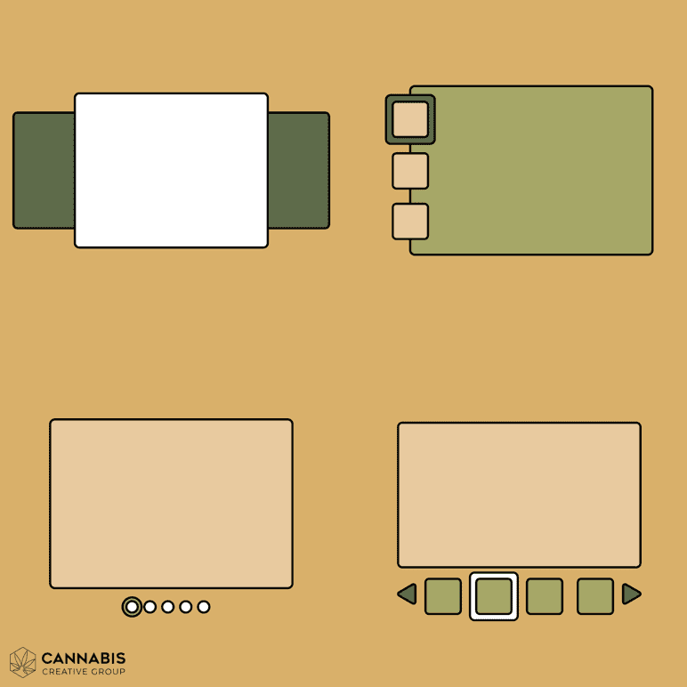
Examples of homepage carousels
Ever come across one of these carousel types while exploring the digital world of cannabis? Chances are you didn’t even click on it.
1. Carousels are conversion killers
70% of online businesses fail due to bad usability. If you care about engaging and converting users, you should never use a carousel on the homepage. Using one on an image gallery or video page is another story.
Carousels are a detriment to engagement. 38% of people will flat out stop engaging with your cannabis website if the layout is unattractive. Elements that move on the page can be downright frustrating.
2. Carousels come with accessibility issues
On mobile devices, there’s an accessibility issue for users with disabilities. Content that automatically moves can cause loss of focus for those using screen readers and keyboards. Distractions are especially difficult for people with cognitive and learning disabilities.
3. Carousels give you banner blindness
You probably don’t even realize that you have banner blindness, which is the tendency to ignore something on a website that looks like an ad. Being that carousels can look like banner you’re your visitors may ignore them and go elsewhere for their cannabis needs.
4. Carousels are overwhelming with choices
Picture yourself walking into a dispensary and seeing all the choices of flower strains. Unless you know what you’re after, it can be overwhelming!
Decision paralysis and the paradox of choice suggest that while we might believe that more options make our choice easier, too many options require more effort and can even make us unhappy with what we chose.
With all the options that a carousel presents to us, we may second guess the choice we make. Did I make the right choice? Did I miss something that could’ve been better? In a worst case scenario, a site visitor might choose nothing at all and go elsewhere for their cannabis needs.
5. Carousels slow down your page speed
According to Google, 61% of users are unlikely to return to your site on mobile if they had trouble accessing it. Adding insult to injury, 40% will go to a competitor’s site instead.
A carousel typically has large images that must be loaded, in addition to needing additional JavaScript to run it. Loading the carousel slows down the speed of your page, and people rarely engage with it. Why bother?
Alternatives to using a carousel
Carousels are not the only option for your website’s homepage. Here are some alternatives that we’ve found to be effective.
Use one image and one call to action (CTA)
What are you trying to get users to do? Is it to purchase a product, get a quote, contact you, or something else? Your homepage should promote the single most important thing you want users to do.
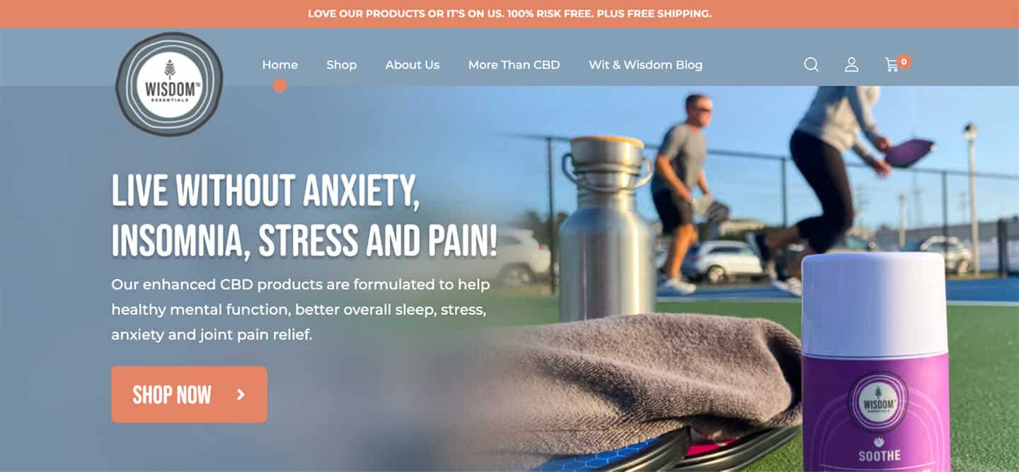
Take Wisdom Essentials, a CBD brand targeting the 45-65-year-old audience, as an example. The main CTA on their homepage is to shop their products.
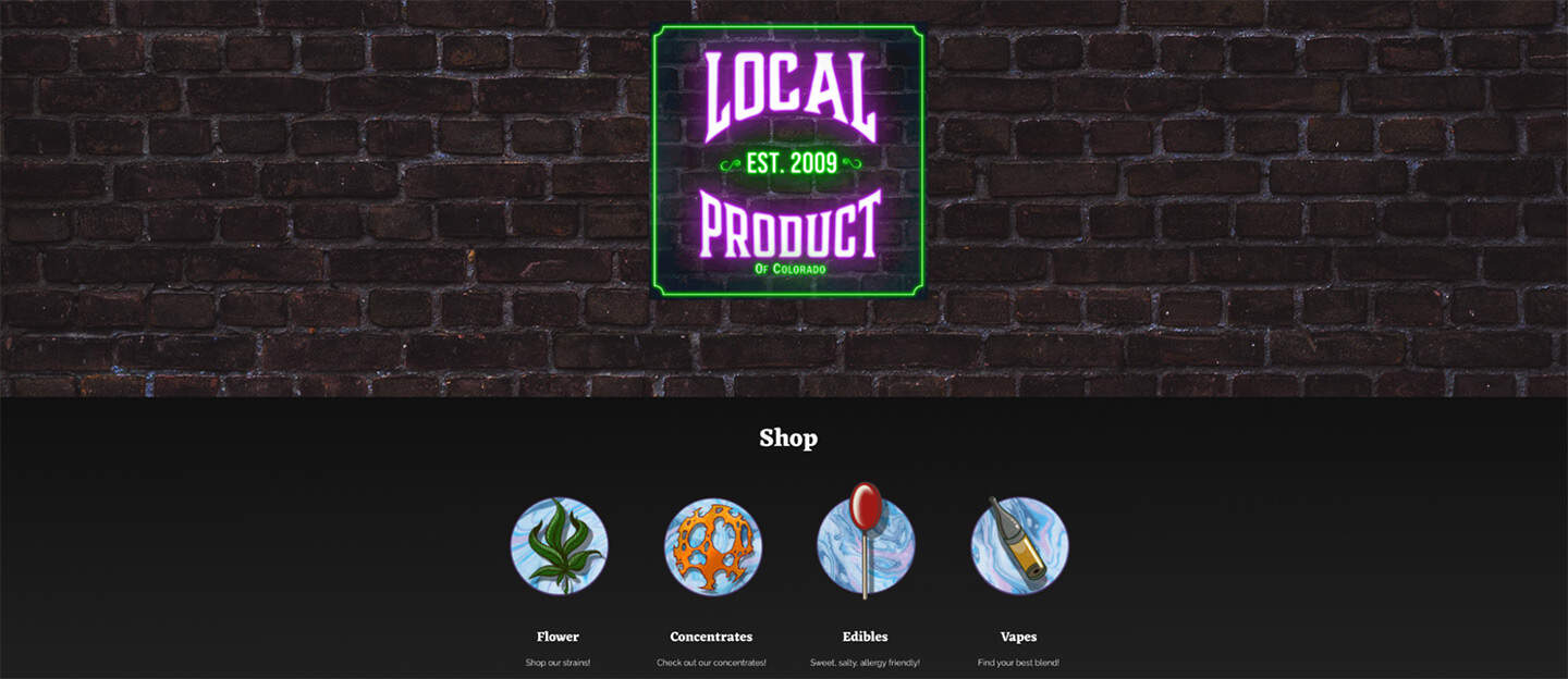
Display carousel slides as blocks
For dispensaries and eCommerce shops, you could showcase your product categories in blocks that link to the respective category pages.
This is what Local Product of Colorado, a Denver dispensary, has done. Their homepage allows users quick access to what they’re likely looking for without animation or frustration.
Don’t complicate the messaging
You want site visitors to immediately understand what your business does.
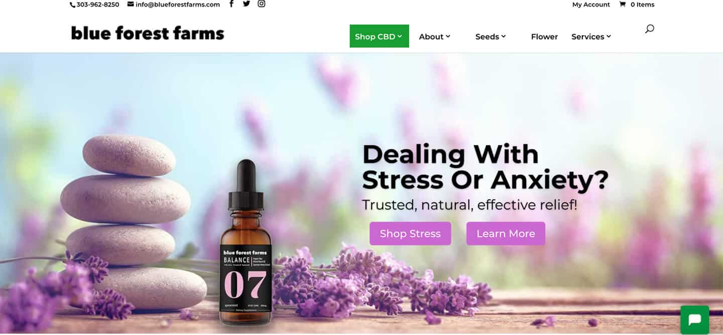
Blue Forest Farms, a lifestyle organization changing the world through renewable hemp products, has several product categories. But on the homepage, they’re promoting just one product line (products for dealing with stress). The messaging is simple and clear – if you’re dealing with stress, you can shop or learn more about CBD.