Cannabis Creative brought the client’s vision of a cool, vintage brand to life.
White Lotus
Our team used the drawing to craft a clean, vintage-inspired logo with modern touches. The colors from the image – black, white and a deep red – were continued throughout the branding design, in addition to a light cream to contrast the darker tones. The prohibition era theme was continued throughout their product packaging, which comprised custom-designed one-ounce bags, with rough vintage font and a stamp featuring the phrase, “The best thing since bathtub gin.
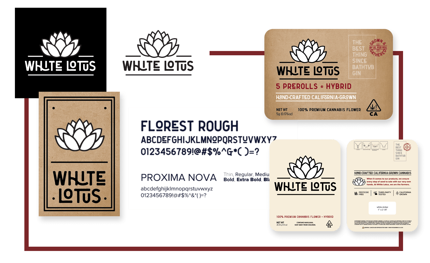
Cannabis Creative worked to integrate the company’s visual standards throughout the packaging, including a statement about their hand-grown, seed-to-sale products and a stamp graphic that reads, “Grown & gathered by us, for you.” The result of our team’s efforts was a striking, cohesive set of visuals that will give White Lotus a unique edge, and make consumers eager to learn more about their one-of-a-kind brand.